
Design system
Mission
CAP Design System to be the first of multiple systems built to support our team of designers and engineers in creating better features and experiences, and with the overall intent of creating a cohesive family of products.
Objective
Build a
single source of truth that groups all the elements that will allow the teams to design, realise and develop a product increasing and maintaining quality.
Key outcomes
- Centralised knowledge base
- Cross-platform consistency
- Less excess.
Deliverables
- Components
- Foundations
- Governance
- Guidelines
Planning
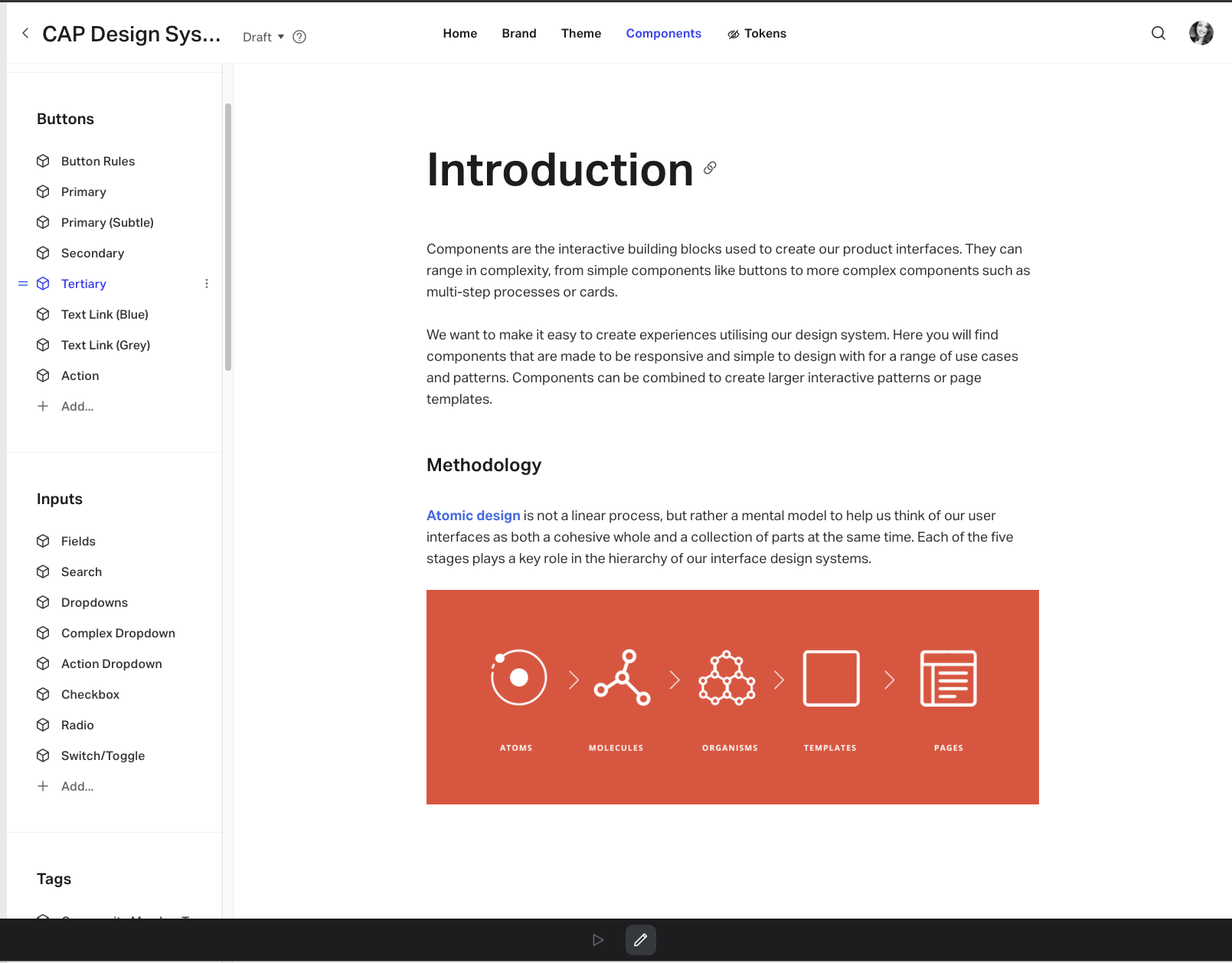
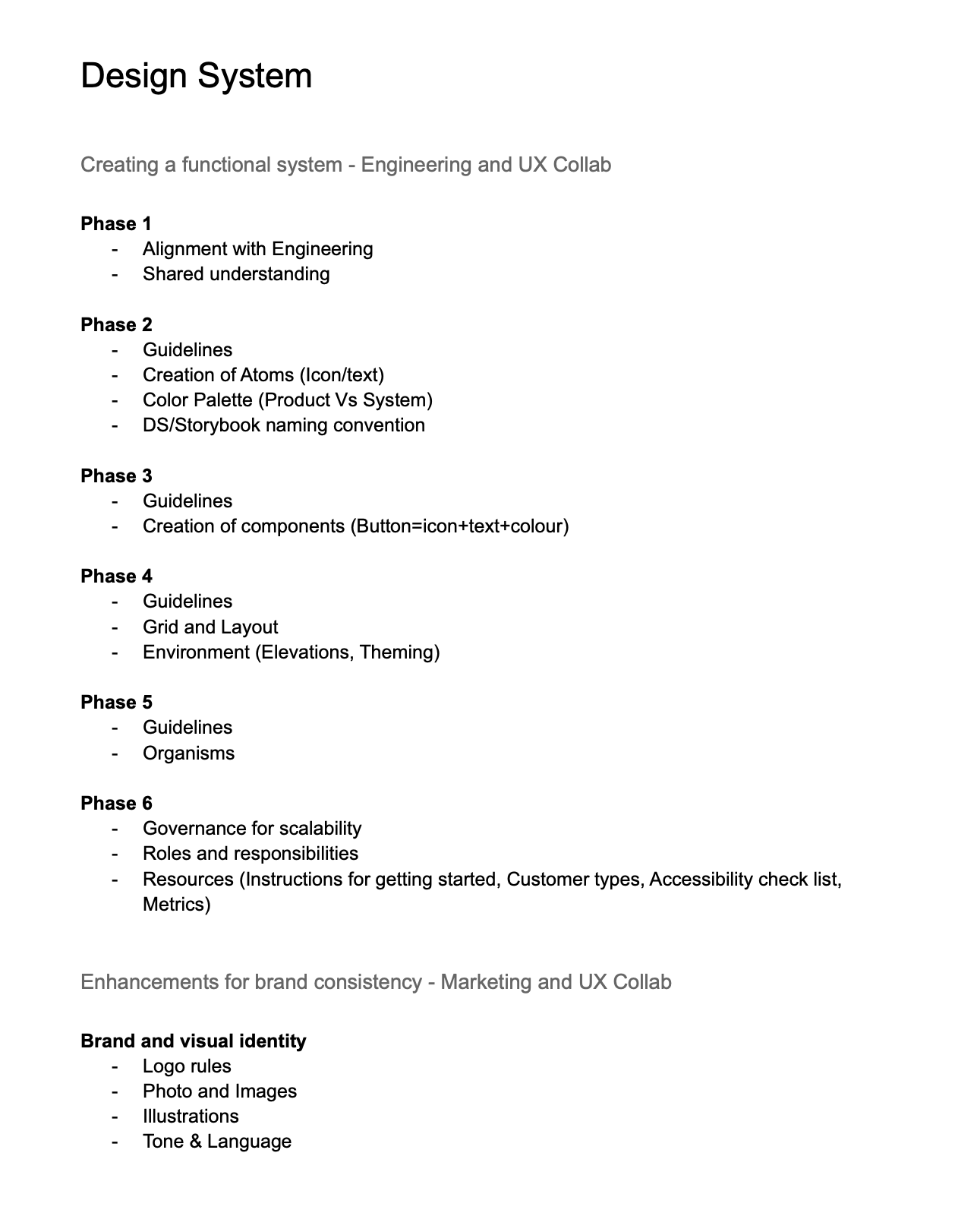
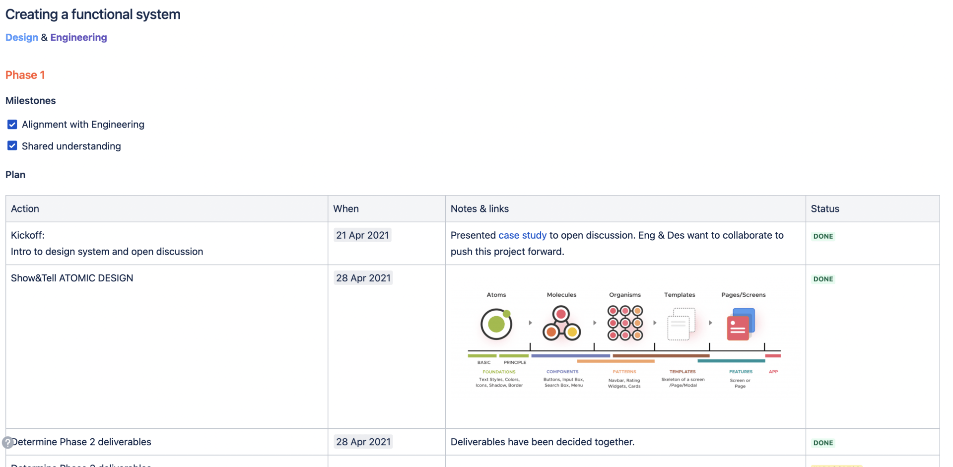
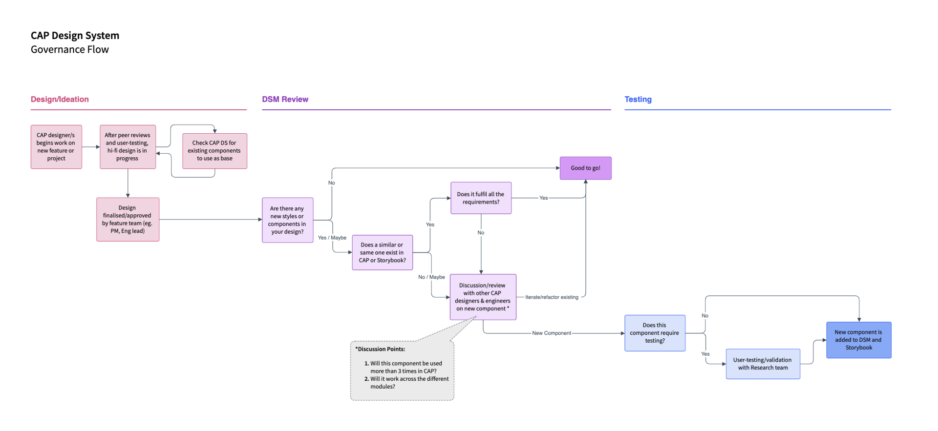
In consultancy with the Lead of Engineering, I've created a plan for executing specific tasks, throughout 6 phases, by the design team. Once the structure was set, we built: foundations, components that aligned with the Storybook library, governance, guidelines and more.
Journey
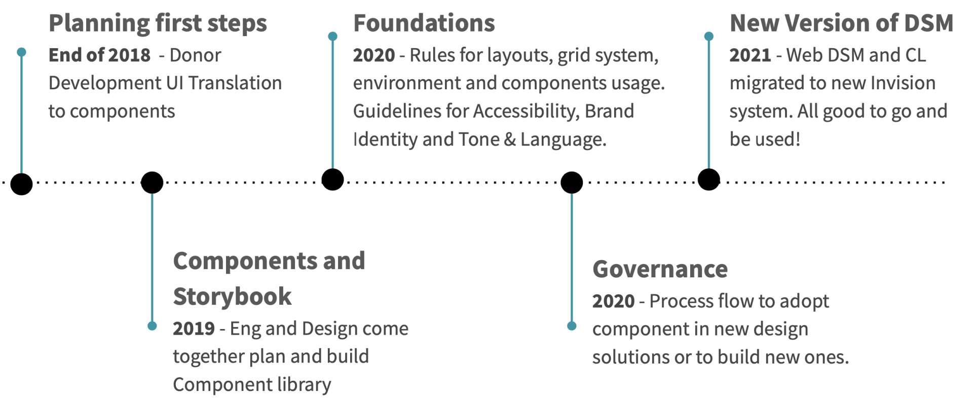
The project started at the end of the year 2018. The engineering team had to start developing features in a new environment. Because of that, the design team took the opportunity to refresh the UI for the coming feature in the roadmap and translate the UI into reusable components. That led us to the beginning of our component library. At the beginning of 2021, we finally socialised the design system to all teams and enabling them to scale quickly, yet maintaining quality.
Resources
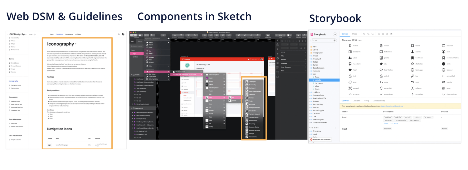
Guidelines are on a web source that is available to everyone within the organisation . For designers, components are available in Sketch by syncing a master file where the component symbols were created. For engineers, the live components are available on Storybook and visible to everyone in the organisation.
Governance
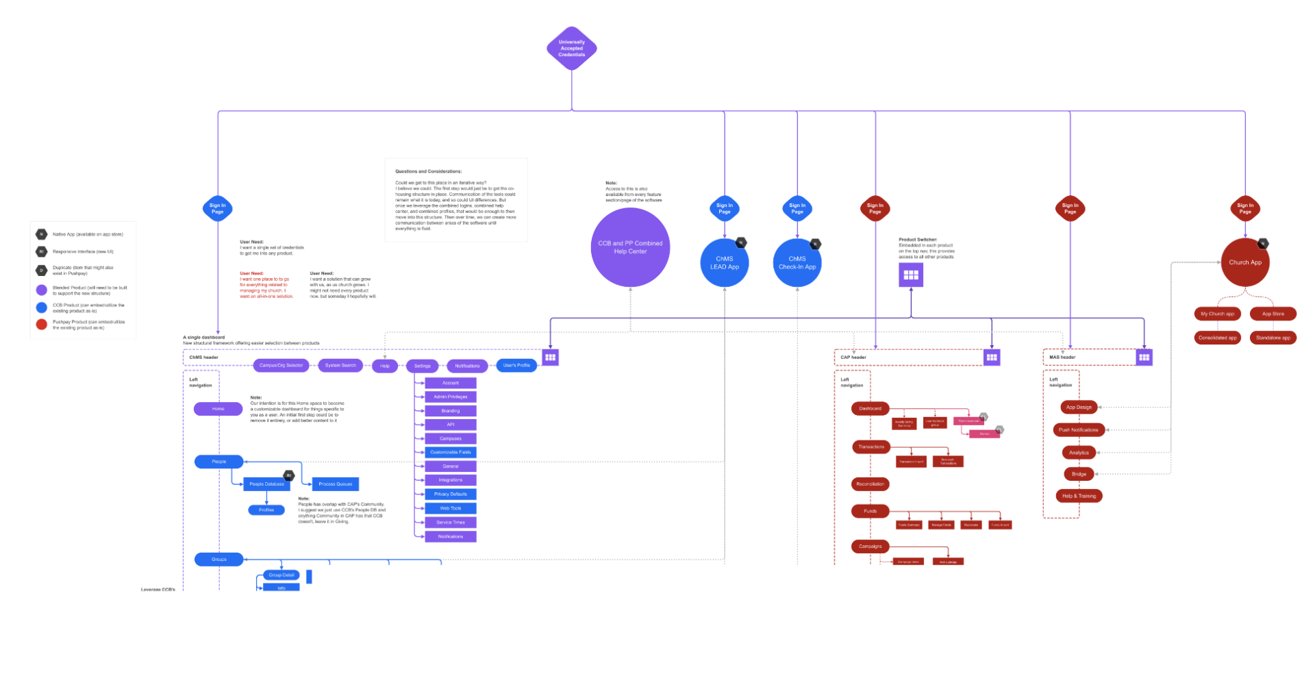
UX CONSOLIDATION
Bringing multiple platforms into one seamless solution. Bridge user flows that may or may not start and end within the same module or even product.